
Now Scheduling Primary Care Appointments Online. Book Now.
It's the sign you've been looking for! Oaklawn introduces new and improved signage.
If you’ve been to Oaklawn Hospital recently, you’ve probably noticed some substantial changes that are happening. From new overhead signage to elevator wraps and exterior signage, these are all things that we’re doing in order to enhance the patient experience, helping to ensure that you can easily find what you’re looking for.
So how did we go about undertaking a project of this magnitude? We started by calling on our friends over at Corbin Design to perform an analysis of our facilities and provide their expert recommendations. Believe it or not, there is more strategy behind wayfinding signage than you might expect, so let’s take a look at some of the major things we considered when updating our signage.
LESS IS MORE.
One of the key things we took away from Corbin’s analysis was that we actually had too much signage! Although people say they prefer more detailed maps and directional cues, they’re actually better at wayfinding when things are simple and stylized. Therefore, we stripped down the amount of signage throughout the Hospital in order to make things less confusing. Our goal with our revamped signage was to leave directional “bread crumbs” of information that will guide you from one point to the next, rather than attempting to provide direction from every single point in the facility (which can actually be more confusing than helpful).
UNIVERSAL SYMBOLS ARE IMPORTANT.
We’ve now incorporated icons on our signage. These icons are identified as universal symbols and are particularly helpful to patients with limited English proficiency, physical or cognitive challenges. Not to mention, our brains started processing images long before we processed words so in most cases, people can recognize an icon faster than they can a word. It simply makes sense to include universal symbols along with text, where appropriate.

EXTERIOR SIGNAGE MATTERS TOO.
The patient experience begins BEFORE a patient walks through our doors. Keeping this in mind, we made it a high priority to ensure that names are used consistently for each entrance, all parking lots are identified, and that access information to other important destinations (Wright Medical Building, Main Hospital, and Emergency Room) is provided at each entrance.
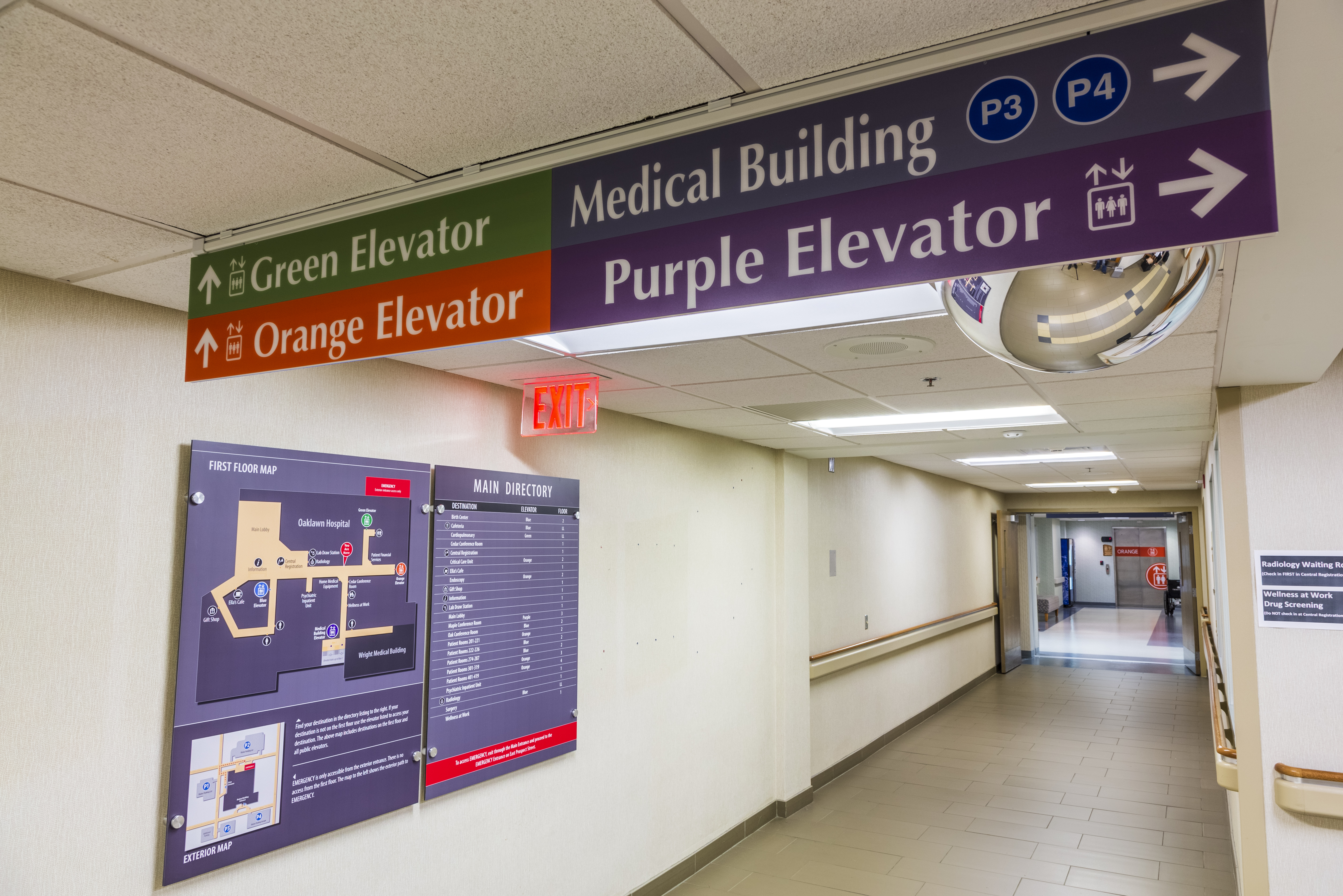
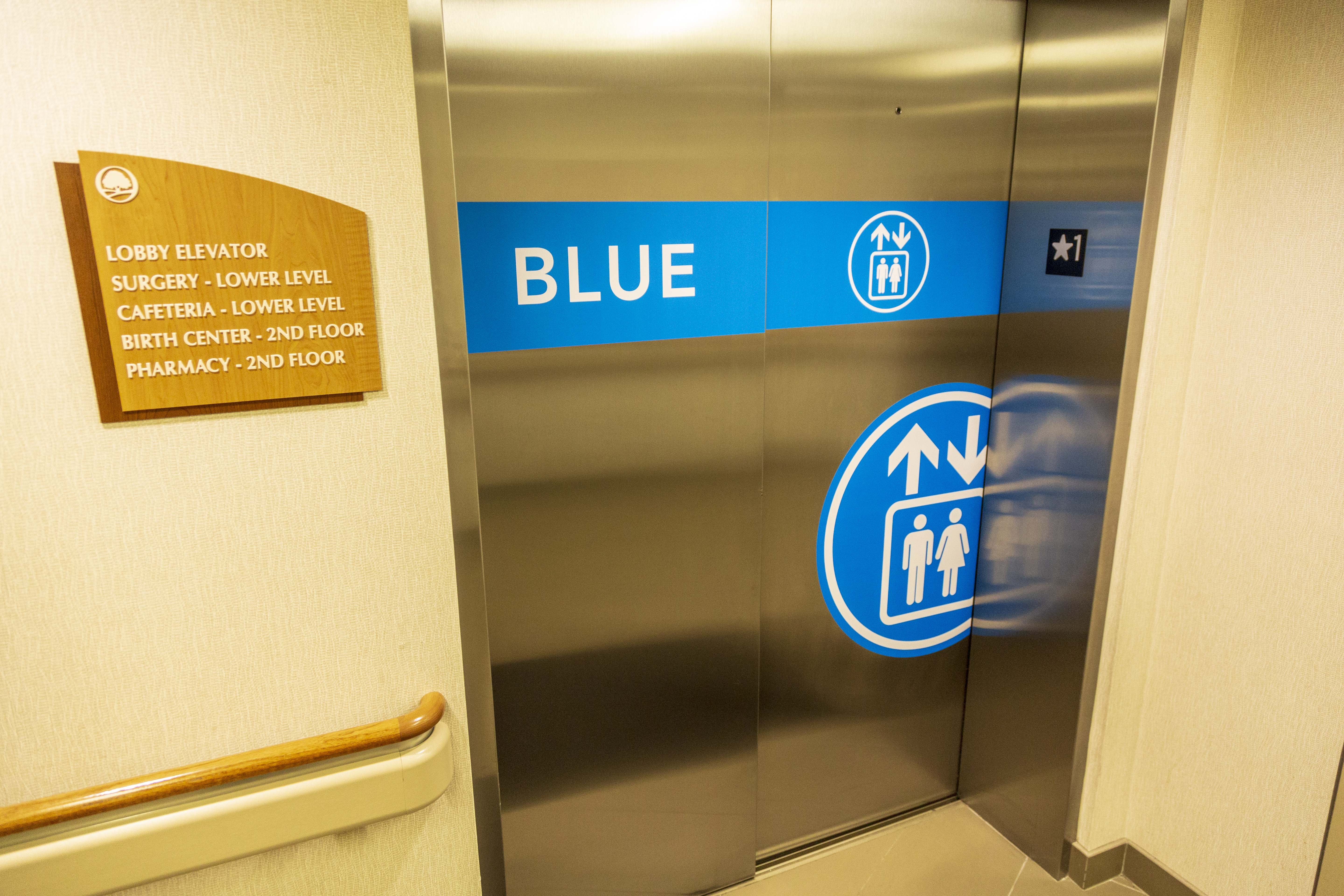
ELEVATORS ARE PRIME REAL ESTATE FOR SIGNAGE.
Perhaps one of the biggest enhancements are the elevator graphics. Elevators are for more than just easily moving to different floors, and they can make a substantial difference in providing important directional cues. Our elevators are now color coded, named (e.x. “blue elevator” to accommodate those who are color blind), and include the universal symbol for “elevator”. Additionally, elevator directories have been installed in the Wright Medical Building and provide a listing of destinations that you can access from each elevator. Hopefully there will be no more confusion about whether to use a Wright Medical Building elevator or a Hospital elevator!
We hope that next time you visit us, you can easily find your way through our new and improved facility. Happy trails!